More New Things for My Home Assistant Dashboard!
It's time to update my Home Assistant Dashboard with new Section Heading entities, Windrose cards, mini-graph cards, and Uptime Kuma alerts.
Smart homes are supposed to be smart enough to do things without human interaction. Turn on lights when entering a room. Turn them off when leaving. Turn on the fan when the air quality gets bad. Turn on the vent fan when the shower runs and the bathroom gets too humid. Make sure all doors are secure and alarm is armed when going to sleep at night. There are many more things that should happen. The reality is that we are not there yet. That is why dashboards/information centers/control panels are still necessary.
In the 2024 year end Home Assistant roadmap update, they outline some of the things that have been done to make dashboards easier to build as well as things that will be coming in the future. There is focus by the Home Assistant team to make the default dashboards more useful, something they have started by make the "Sections" layout the new default.
I have built my dashboard using this Sections layout and have been running this way for a while now. I have a couple of videos on this new layout here and here.
I like to continue to improve and update my dashboards, especially as the technology evolves. In that regard, I have made additional changes and improvements since the last time I posted a dashboard update and I wanted to share those with you. In this article I will cover the changes I made since the last video on dashboards.
Blog posts are not a very friendly way to showcase a dashboard so I encourage you to watch the videos as well. That is also why you don't see corresponding blog posts for the previous videos on this dashboard.
Current Dashboard
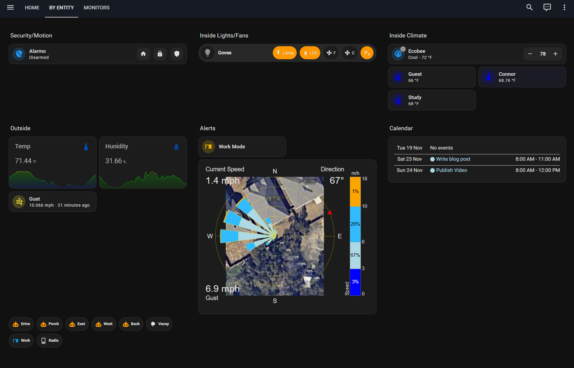
Using visibility conditions in the new sections layout dashboard, I am able to hide a bunch of entities that I don't need to see unless they are within the conditions I set for those cards. That makes the dashboard cleaner and more focused.
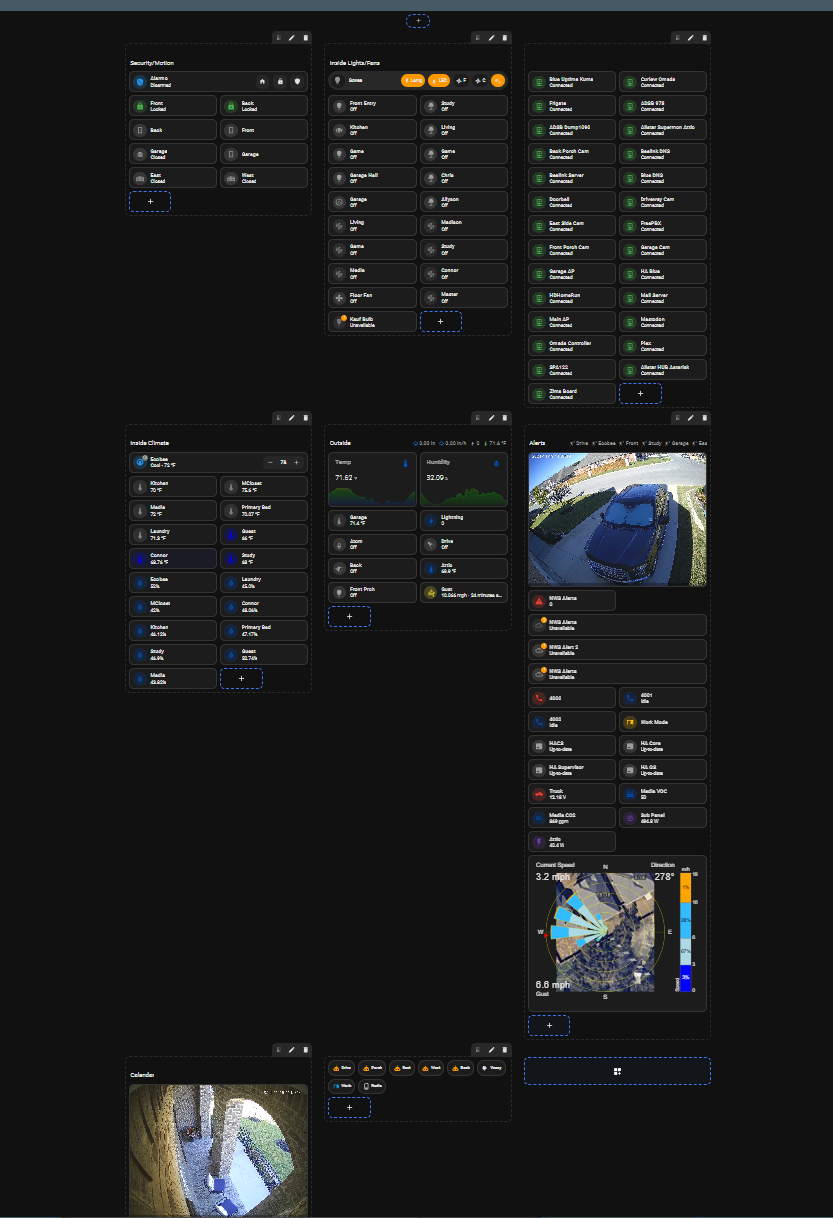
As you can see below, this is the full dashboard with all entities shown while in edit mode. Having the ability to set visibility rules greatly enhances the usefulness of the dashboard and allows focus on only the things that matter in that moment.
NEW: Section Headings
Section headings are nice new way to display information. They are essentially part of the title of the individual section.
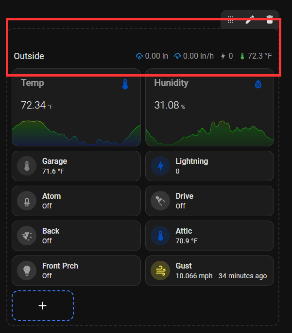
Section heading entities can be treated the same as other cards in the section, making them even more useful. Entities are defined in the heading configuration and then each one can be customized, including the visibility criteria.
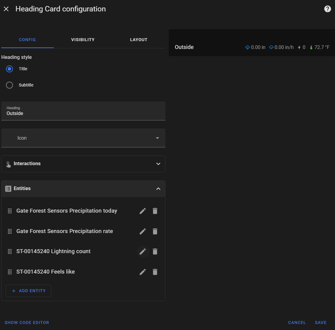
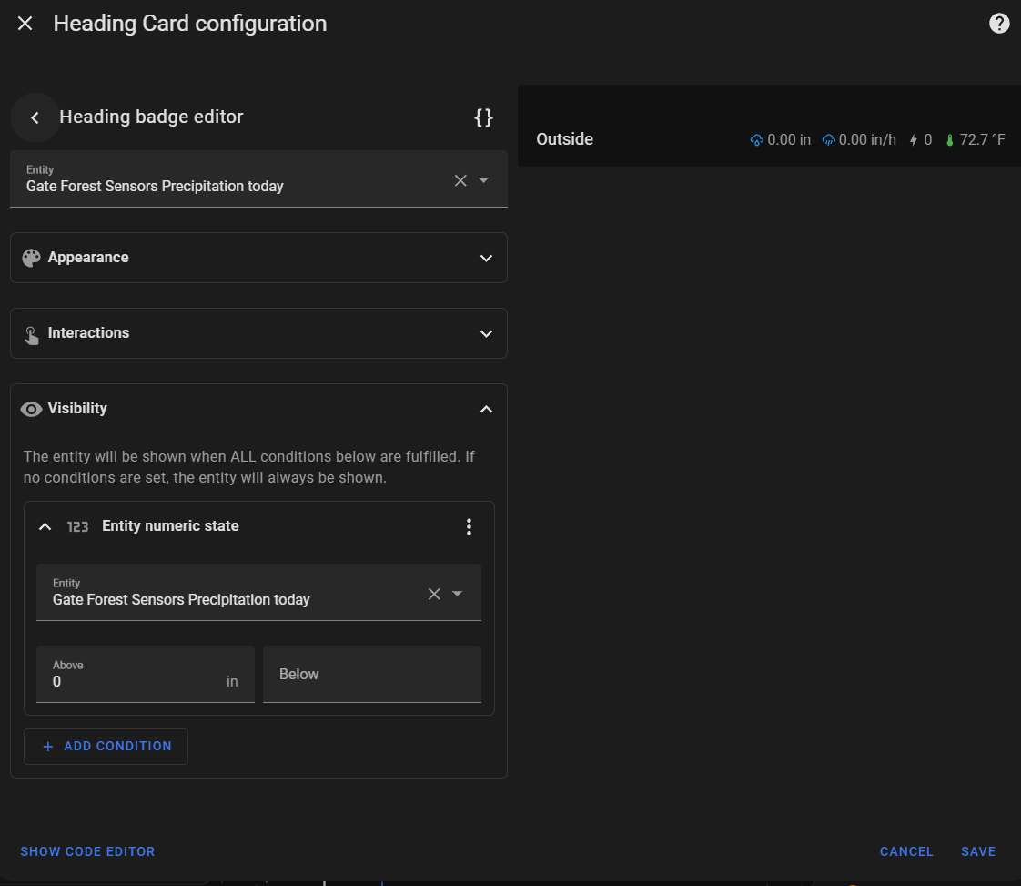
The left image shows the heading configuration with entities and the right shows an individual entity configuration with the visibility section expanded.
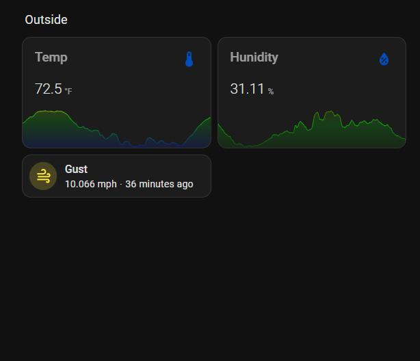
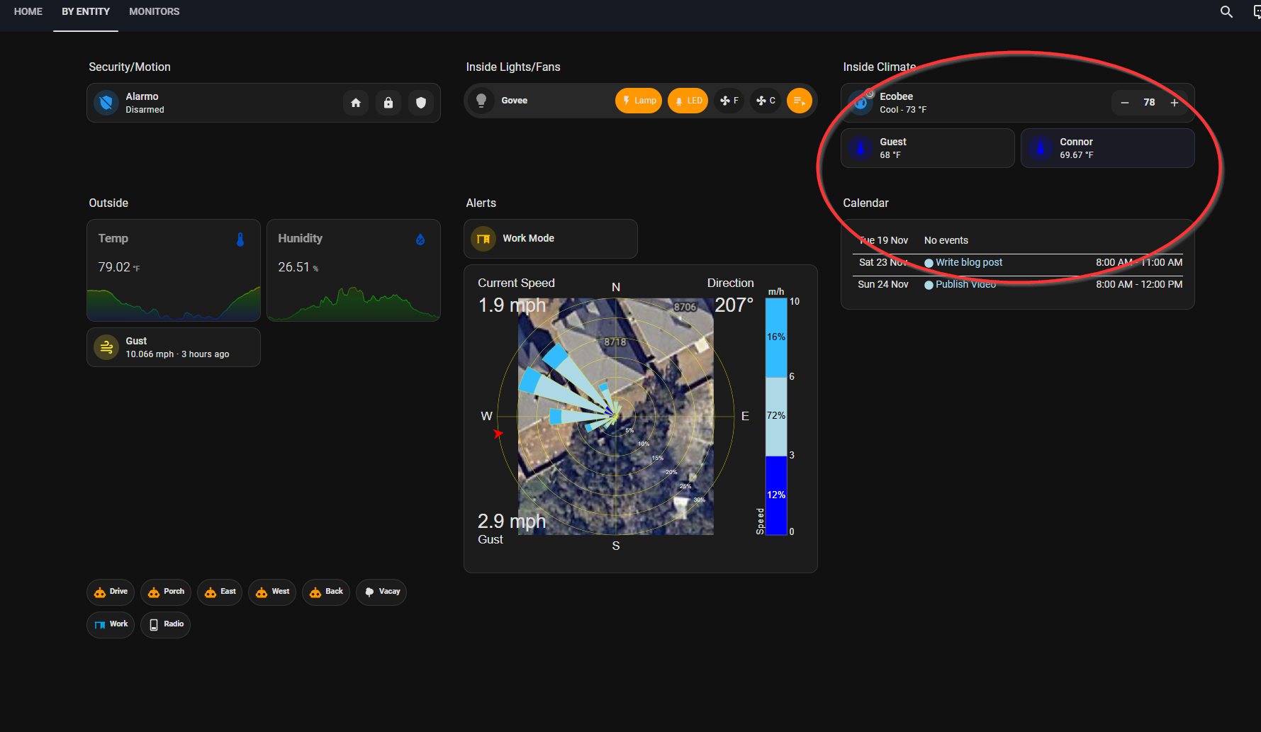
In the image below, you don't see any entities in the section heading because the visibility criteria for them has not been met.
CHANGE: Mini Graph Card
One of the things I did miss from my old dashboard was the ability to add some color to my graph cards. Home Assistant has a built-in sensor card that will display a graph on a card but it is only one color.
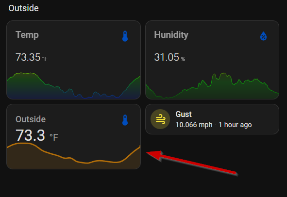
I added the mini graph cards to allow more flexibility in how I display the data. I set the colors to change based on sensor values and also adjusted some font settings.
The sensor card allows for setting the height and width of the card from the UI. Because the mini-graph-card has no UI editor capability, setting the layout of the card has to be done in yaml.
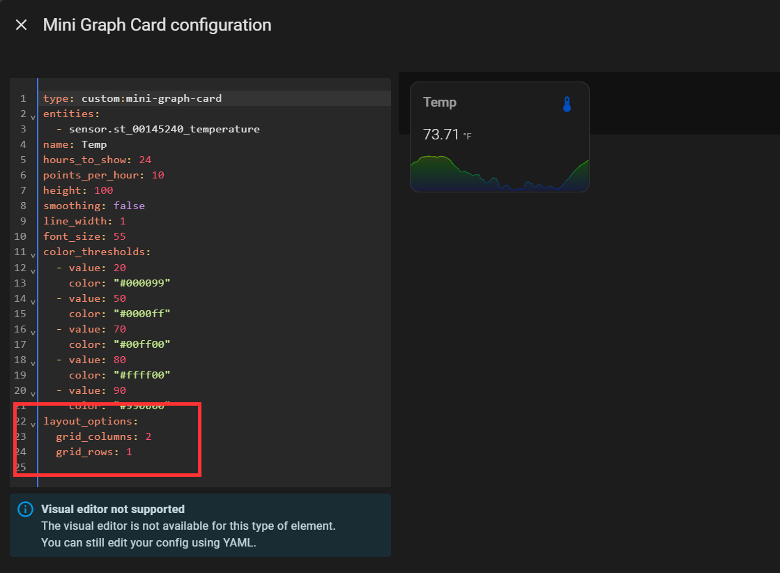
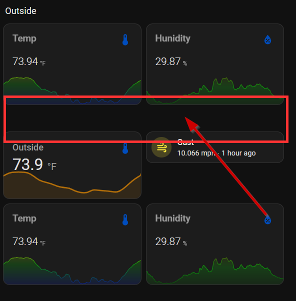
This is not perfect because in order to prevent overlap of the cards below the mini-graph-card, the layout needs to be set to 4 grid_rows and that causes some "white space" to appear below the card.
The way I overcame that was to put both cards inside a grid card, which does allow for setting the layout via the UI and makes it look like it should.
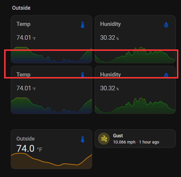
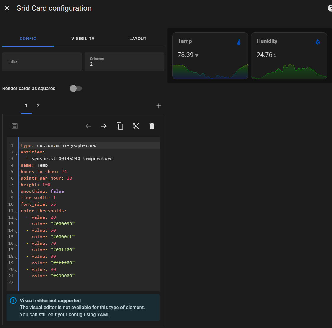
The top row of cards and the second row are identical from a viewers perspective. The ability to move those two cards individually is lost but that isn't needed anyway. I'll stick with the grid card option until the mini-graph-card is updated to be able to take advantage of the sections layout options (which is up to the card developer and not Home Assistant).
Alright, enough about those cards. Let's move on.
NEW: Windrose Card
I have always been a weather person. I have a multitude of radar apps on my phone and I keep a few dozen weather sites bookmarked so I can get an accurate picture of forecasts based on input from many models. I also have a Tempest weather station in my backyard. From this I get all of the standard weather inputs, including wind speed and direction. On my dashboard, I wanted to see a visualization of those two values, especially during the fall/early winter time of year when sudden shifts in wind direction indicate the arrival of cold fronts. The windrose-card ticks all the boxes for me.
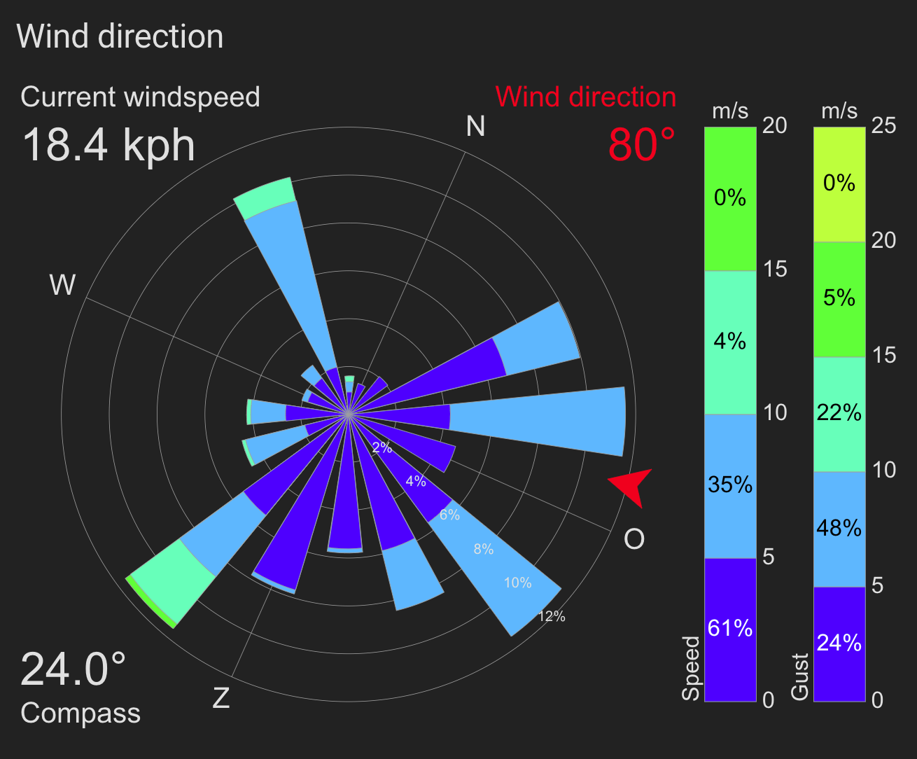
The windrose-card is very customizable so it can be set up in most any way you want. For example, my card looks like this:
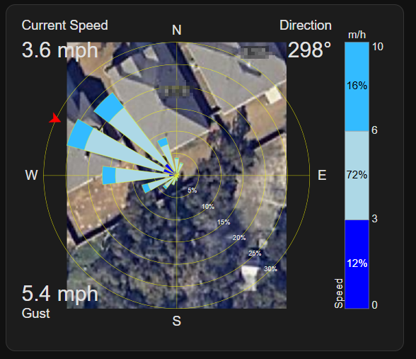
As you can see, it is even possible to place an image on the card. I have the location of the weather station as well as my house footprint in the picture (Google Maps view). This gives a very easy visualization of where the wind is coming from in relation to the house. I need an overhead drone shot for better resolution. Anyone want to send me a drone?
The windrose-card is another that doesn't have a UI configuration option, so here is the yaml I use to set the options. As you can see, there are a ton of options and I have only set but a few of them. It is even possible to show more than one windspeed entity at the same time, such as wind speed and wind gust as you can see in the example above. I chose to show only one (for now) on my card.
type: custom:windrose-card
data_period:
  hours_to_show: 2
windspeed_bar_full: false
wind_direction_entity:
  entity: sensor.st_00145240_wind_direction
windspeed_entities:
  - entity: sensor.st_00145240_wind_gust
    name: Speed
speed_range_beaufort: false
output_speed_unit: mph
speed_range_step: 5
speed_range_max: 25
windspeed_bar_location: right
speed_unit: mph
refresh_interval: 60
corner_info:
  top_left:
    label: Current Speed
    unit: " mph"
    entity: sensor.wind_speed_rounded
  top_right:
    label: Direction
    unit: °
    entity: sensor.st_00145240_wind_direction
  bottom_left:
    label: Gust
    unit: " mph"
    entity: sensor.wind_gust_rounded
current_direction:
  show_arrow: true
  arrow_size: 40
  center_circle_size: 30
center_calm_percentage: false
windrose_draw_north_offset: 0
wind_direction_count: 16
speed_ranges:
  - from_value: 0
    color: blue
  - from_value: 3
    color: lightblue
  - from_value: 6
    color: hsl(200, 100%, 60%)
  - from_value: 10
    color: orange
  - from_value: 18
    color: red
background_image: /local/house11.png
colors:
  rose_lines: yellow
NEW: Cameras
I am titling this section cameras because there are many ways to display cameras on a dashboard.
In the 2024.11 release of Home Assistant, there were improvements made to the speed that cameras display the streams. This is made possible by using WebRTC whenever possible when rendering a camera stream. For those that don't know, WebRTC is a standard that allows for peer-to-peer connections to cameras (and other streams) for lower-latency audio and video.
You will notice that my cameras are not visible in the dashboard examples I've posted so far. That is because they are hidden until the visibility conditions are met--when a person enters one of my camera zones defined via my Frigate NVR instance. Because Frigate provides an event, I am able to use this to trigger the visibility. One of the things that is absolutely necessary for this to be usable is for the camera stream to load very quickly. With the new WebRTC updates in Home Assistant, I felt it was time to try it out.
As I mentioned, there are different ways to display the cameras in Home Assistant. I am using the picture-glance card to display my cameras.
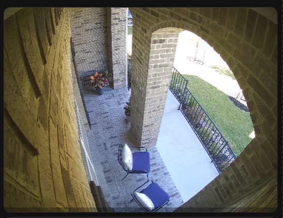
The picture-glance card is able to be configured via the UI and that makes it easy to set up. There really isn't much to it and the yaml configuration shows how little is necessary.
camera_view: live
type: picture-glance
entities: []
camera_image: camera.172_31_10_21
visibility:
  - condition: state
    entity: binary_sensor.front_porch_all_occupancy
    state: "on"
NEW: Uptime Kuma Alerts
My home network is not massive, but I do have some things I want to monitor to make sure they are running. I use an add-on called "Uptime Kuma" to monitor 27 different services/devices.
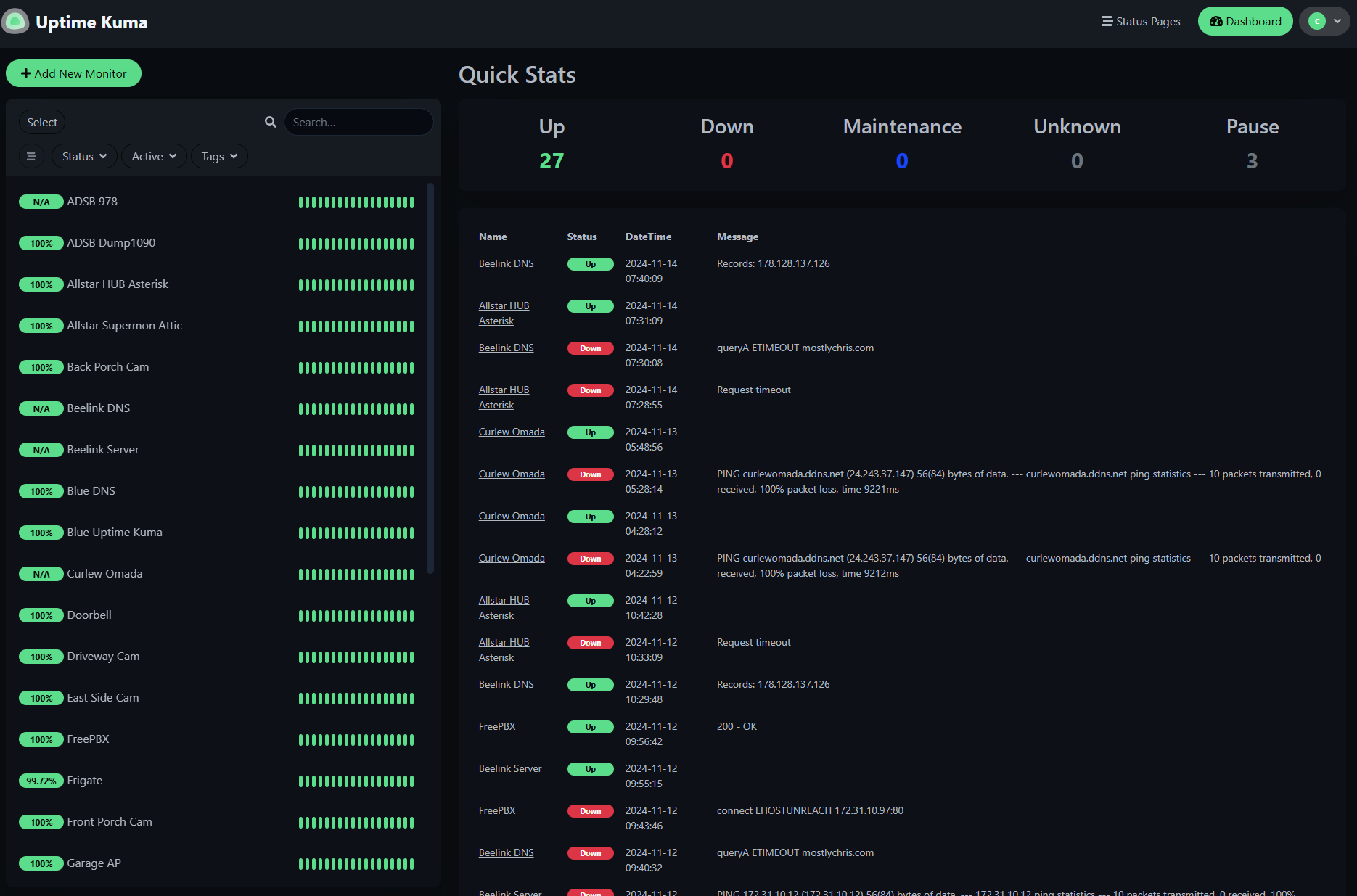
Uptime Kuma has a number of notification options that can be set via its interface. In addition to those, because sometimes I forget to check on something, I wanted any currently down devices/services to display on my dashboard. I installed the Uptime Kuma integration in Home Assistant which gives me binary sensors for every monitor.
I created a tile card for the monitors and assigned visibility rules to only show if the binary sensor for the monitor indicates it is down (disconnected).
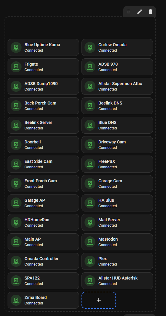
Since I didn't add a title to that section, it is completely hidden unless something goes down. In that case, it would insert itself between the inside lights and inside climate sections, moving everything to the right one column (or down depending on the device the dashboard is displayed on).
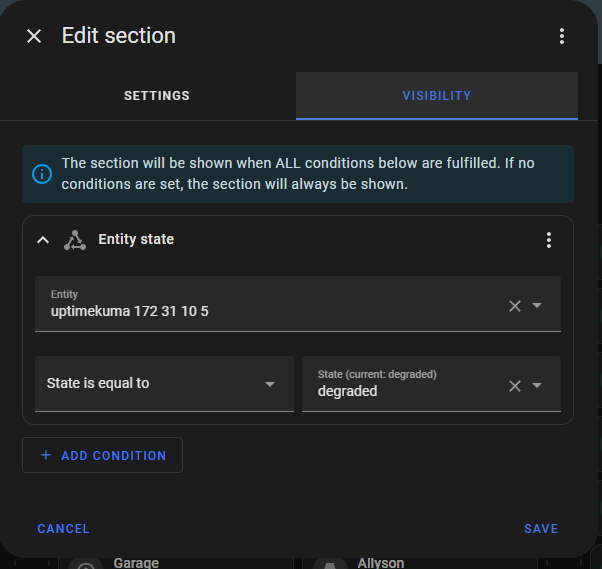
The Uptime Kuma integration also provides a sensor showing current status of the overall system. If any devices are down, that sensor goes into a "degraded" status. That is how I hide the whole section. The section only shows when Uptime Kuma is in a degraded status.
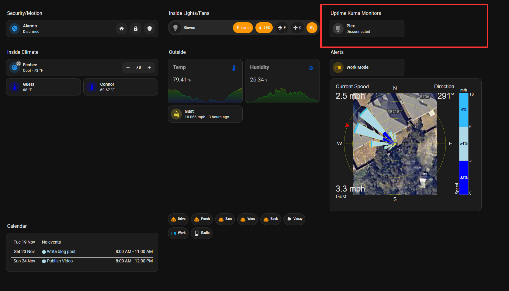
When something does go down, it is nicely displayed right on the dashboard. The sections becomes visible and the down device(s)/service(s) are shown.
Conclusion
Dashboards are very much a personal preference. This is my latest iteration of my dashboard with things that matter to me. In my opinion, making the sections layout the default view in Home Assistant as the right move. It is now very easy to make something beautiful and useful.
I hope I inspired you to build something for yourself. Make sure you watch the video that goes along with the post and thanks for reading!
